by DesmondMilesDant


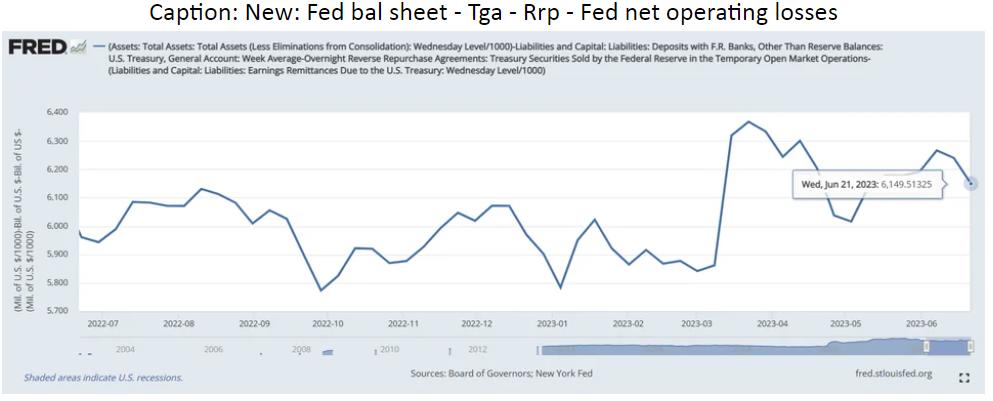
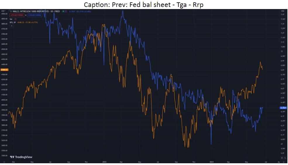
Well in the first as written in the flash screen: Fed bal sheet – Tga – Rrp – Fed net operating losses. As for the second chart it’s the old measure: Fed bal sheet – Tga – Rrp.
P.s. Not mark to mark but when paying up more in interest than receiving in bonds and notes.
Views: 73