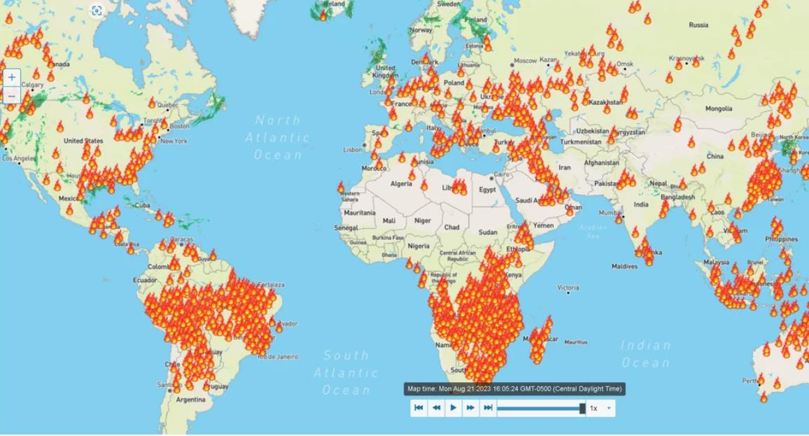
I saw a video of a guy talking about fires around the world. He referred to this map, you can enable the filter to see live fires in the options. Here is a link to it – https://www.wunderground.com/wundermap
First disable the weather stations, then scroll down on the side and check the box for “Active Fires”, then you should see something like the image.
The guy in the video said that the fires are detected by satellite. I don’t know if that is actually the case.
I checked a government wildfire map and it doesn’t show all the fires in the southeastern US but it shows a lot more in the western US. You can check that map out here – https://inciweb.nwcg.gov/
What do you think is going on?
Biden is getting ready to declare a “climate” emergency over wildfires – https://www.msn.com/en-us/news/us/biden-faces-calls-to-declare-climate-emergency-as-he-heads-to-maui/ar-AA1fvSnL
I just found a third map that has a time filter – https://www.fireweatheravalanche.org/fire/
I asked ChatGPT about the differences with the maps and it said the following:
As of my last update in September 2021, Weather Underground sources its data from various providers, depending on the specific type of weather information. However, when it comes to specifics like the “active fire map data,” I would not have real-time or the most up-to-date information on their sources.
There could be several reasons why Weather Underground’s map might not match a government source:
Different Data Sources: Government agencies and private companies might have different primary sources of data. For instance, NASA and NOAA satellites provide fire data that is used by many, but not all entities might have access to or choose to use the same data. Some might use data from local fire departments, regional reports, or other satellite sources.
Update Frequency: Some maps are updated in near-real-time, while others might be updated only once or a few times a day. This difference in update frequency can lead to discrepancies, especially when fires are spreading quickly.
Data Processing: Even if two organizations use the same raw data source, how they process and display that data can differ. For example, one map might show only confirmed fires, while another might display suspected fires or hotspots that might not be actual fires.
Resolution and Sensitivity: Different satellites and sensors have varying resolutions and sensitivities, leading to potential discrepancies in the detected fires’ size and intensity.
Aesthetic and Design Choices: Some maps might emphasize certain fires over others, use different color schemes, or apply other design choices that could affect perception.
If you’re trying to determine the most accurate and current information about fires, it’s a good practice to consult multiple reliable sources, including official government websites dedicated to fire information.