via Michael Lebowitz
The financial media frequently opines on what the daily gyrations of the VIX (implied volatility index) signal regarding investor sentiment. Despite how often it is quoted and discussed, many investors do not truly appreciate what implied volatility measures.
We take this opportunity to help you better understand implied volatility. Furthermore, we discuss other lesser-followed measures of implied volatility that help better assess whether implied VIX readings infer bullish or bearish sentiment.
The timing of this article is essential as the VIX has been rising alongside the market in a non-typical fashion. With the presidential election in a few weeks, the Fed changing course on monetary policy, and Israel potentially attacking Iranian oil facilities, the increasing level of implied risk should not be shocking. Will the elevated VIX persist alongside the rising market, or will the market correct?
What Is The VIX
The VIX volatility index, aka the “Fear Index,” is a well-followed measure of investor sentiment. Many investors believe that an increase in the VIX indicates that market participants are growing concerned about the stock market. While that is often true, it is not always true.
The VIX uses the prices of many one-month calls and put options on the S&P 500, weighing them based on their time to expiration and the difference between the strike price and the current price of the S&P 500. Based on the prices, the expected variance of the S&P 500 is estimated. After some advanced math, the VIX value is provided and expressed as an annualized percentage. Furthermore, the VIX is quoted as a one-standard deviation change. In other words, there is a 68% probability the S&P 500 will stay within the VIX percentage.
For example, a VIX of 15 implies expected annual volatility of 15%. In this case, the options market expects, with 68% certainty, that the S&P 500 will trade in a 15% range from the current level over the next year.
The graph below puts the recent range in the VIX in context. It shows how much change is and was expected for the S&P 500 based on the current (22), highest (37), and lowest (12) levels of VIX over the past year. The ranges vary significantly based on the VIX.
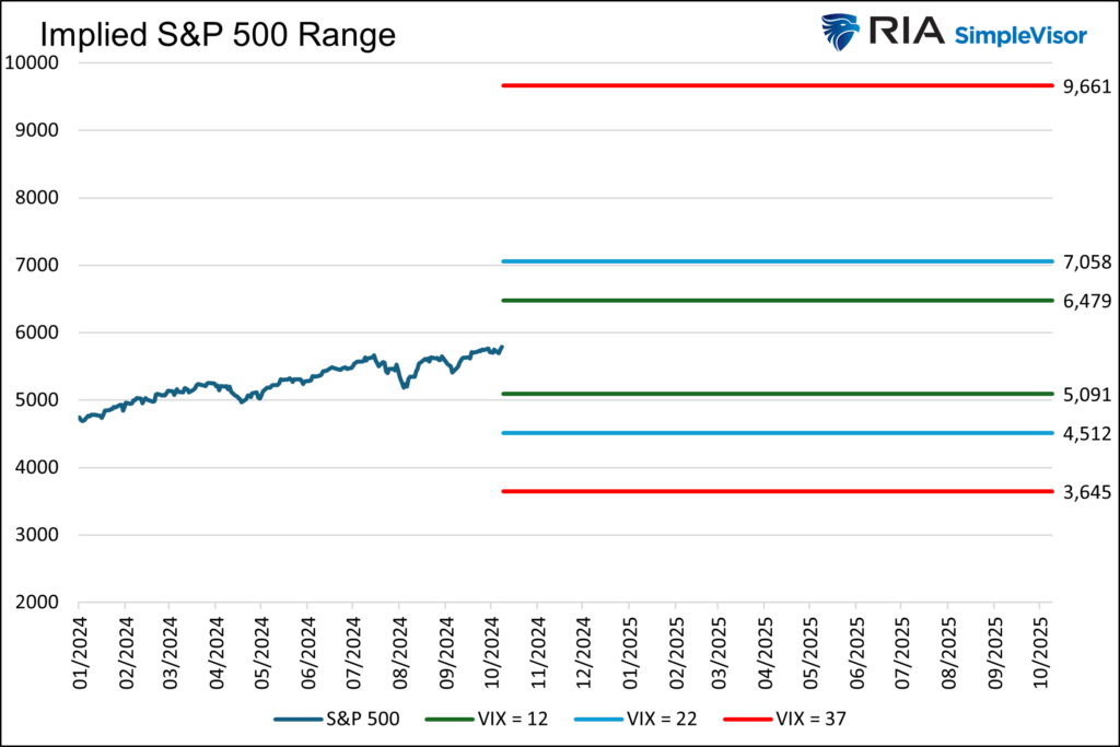
The VIX defines what market participants, in aggregate, think the possible market range will be. However, it doesn’t determine whether the put or the call has a larger influence. Accordingly, it doesn’t disclose whether the market is speculatively betting more on the upper band of the range or whether investors are aggressively protecting against the lower band.
Fortunately, as we now discuss, other volatility measures shine additional light on market expectations.
Put Call Skew
Put call skew measures the difference between put and call option prices at various strike prices for the same index or asset. When the price of a put and call differs despite being equally distanced from the strike price and with identical expirations, skew exists. Skew simply measures if investors are paying more for calls or puts.
A lower skew means investors are more aggressively buying call options than put buyers are looking for protection. Conversely, a positive skew implies investors seeking protection via puts are more aggressive than bullish call buyers.
The put-call skew helps us better appreciate whether bullish or bearish investors have a more significant impact on the VIX.
The graph below, courtesy of Market Chameleon, shows the put-call skew and its 20- and 250-day averages. Currently, it’s on its shorter 20-day moving average and above its longer-term averages. Thus, investors are more aggressive in buying puts than calls compared to recent history. This graph, like the VIX, implies that investor sentiment is bearish.

Put Call Ratio
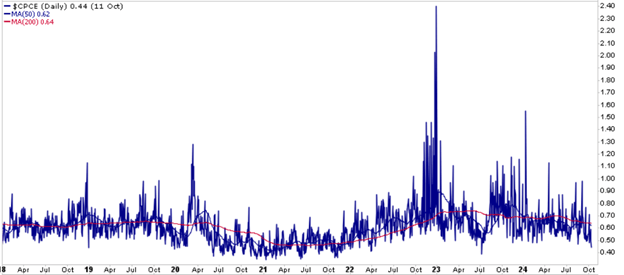
Unlike the skew and VIX, the put-call ratio gauges sentiment by measuring the volume of options contracts. The ratio divides the volume of put options by the volume of call options over a specific period. A ratio below one suggests bullish sentiment, as more call options are being purchased than put options. Conversely, a ratio above one reflects a bearish sentiment.
As shown below, the index is currently at one year lows and the second lowest level since March 2022. Simply the volume of call buying is more than double that of puts. More simply, stock hedgers are few and far between.
CBOE Skew Index
Unlike the VIX, which measures expected market volatility with an expected one standard deviation or 68% band of accuracy, the Skew Index calculates the likelihood of extreme tail events defined as those of two to three standard deviations. While the Skew index and the VIX tend to move in the same direction, any differences can provide clues. Like the VIX, the Skew Index does not enlighten us on whether call or put trading drives the index.
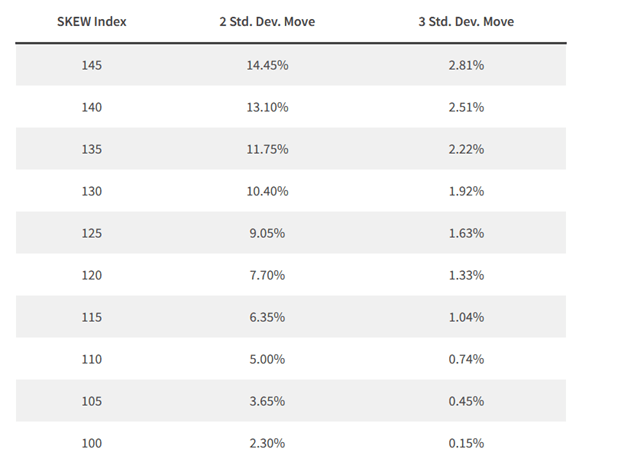
The Skew Index uses the prices of out-of-the-money (OTM) S&P 500 options. The index typically ranges from 100 to 150. Readings of 120 or less tend to reflect a stable environment. As it rises above 120, it suggests investors are increasingly betting on or hedging against a more outsized market move.
The table below, courtesy of VIXFAQ.com, quantifies the volatility implied by the Skew Index. For example, an Index reading of 130 indicates a 10.40% chance of a two-standard deviation move in the next 30 days and a 1.92% chance of a three-standard deviation change.
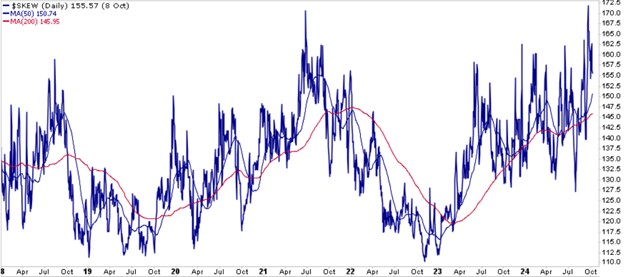
The graph below, courtesy of StockCharts, shows that the CBOE Skew Index is near its highest level in the past five years, suggesting investors are betting on higher-than-average levels of implied volatility to continue.
Current Situation
We wrote this article to help better explain the VIX and implied volatility. Moreover, it’s important to consider whether the rising VIX alongside the market might be a warning worth heeding.
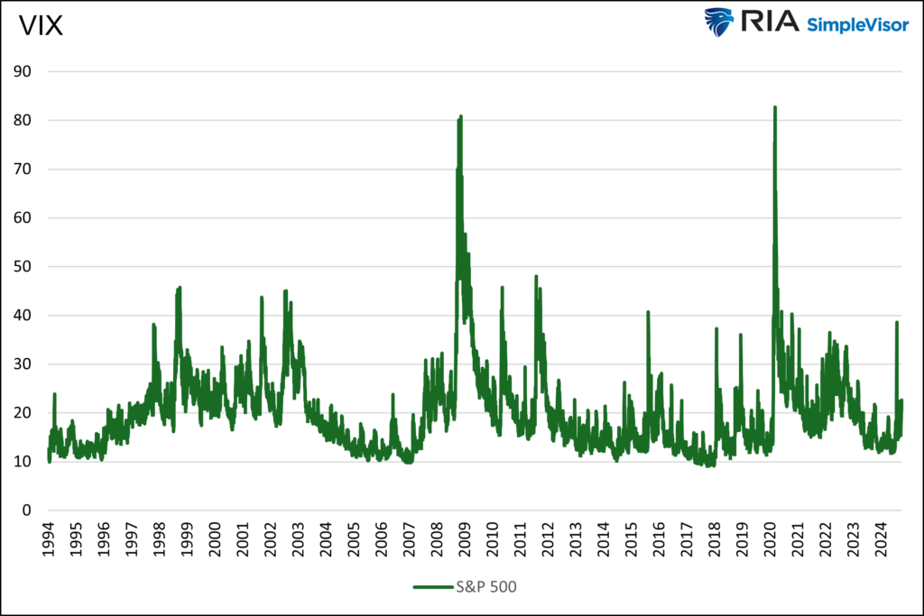
Such behavior is not typical, but it’s not unprecedented either. The first graph shows that the uptick in the VIX is still very mild in the context of its 30-year history. The second graph pinpoints similar periods where the S&P 500 was within 1% of a record high. As it shows, it may ultimately signal a significant drawdown, but that signal may be too early. In fact, based on history, it could be years too early.
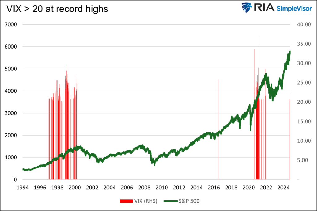
In addition to the VIX, we presented other implied volatility calculations. The two skew measures support the theory that the higher VIX is more of a function of put buying than call buying. However, the put-call ratio, which sits at a one year low, does not confirm the negative sentiment. In fact, it is quite bullish.
The message we take away from the mixed options data is that the market is anxious but not fully committed to an overly bullish or bearish stance. As we note at the beginning, plenty of potential events warrant unease.

Summary
If the VIX remains elevated or continues to increase and the other indicators confirm that put buying is driving the VIX higher, stay alerted for changes in market patterns. Pay closer attention to technical analysis, including where prices lay compared to their key moving averages.
The VIX is currently warning of the potential for bearish price action. While the warning is helpful, remember that if one were solely positioned according to the VIX between 1997 and 1999, they would have forfeited massive profits.