I keep seeing people focus on one chart.
The problem is there are now several of them pointing in the same direction.
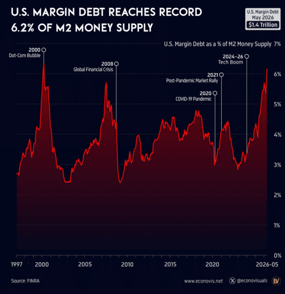
US margin debt just hit $1.4 trillion, equal to 6.2 percent of M2 money supply, almost matching the 6.3 percent peak reached during the Dot Com bubble.
Semiconductor stocks relative to M2 are now trading at double their Dot Com peak.
The S&P 500 price to sales ratio sits around 3.2, above both its long term average and the 2000 bubble peak.
Semiconductor companies now make up 19.7 percent of the entire S&P 500 after roughly quadrupling since 2020.
Foreign investors now hold their highest allocation ever to US equities, leaving less new money on the sidelines if sentiment changes.
South Korean leveraged semiconductor ETFs now control assets worth several times the daily trading volume of the stocks they track, raising questions about liquidity if everyone heads for the exit together.
Even Michael Burry is again warning that the AI bubble is nearing its end.
None of these indicators tells you exactly when a market peaks.
History shows bubbles can stay irrational much longer than people expect.
What matters is how many warning lights are turning on at the same time.
That list keeps getting longer.
GlobalMktObserv margin debt warning: https://x.com/GlobalMktObserv/status/2073724825214889996
FirstSquawk margin debt near Dot-Com record: https://x.com/FirstSquawk/status/2073730669109465304
GlobalMktObserv S&P overvaluation: https://x.com/GlobalMktObserv/status/2073790256919232798
Barchart semis vs M2: https://x.com/Barchart/status/2073519964477165571
WSB post on South Korean chip leverage: https://www.reddit.com/r/wallstreetbets/comments/1unk8bf/leverage_in_south_korean_chip_stocks_is_out_of/
ThierryBorgeat foreign investor allocation: https://x.com/ThierryBorgeat/status/2073859060957626514
StockMKTNewz on Burry AI bubble: https://x.com/StockMKTNewz/status/2073731367842509177
ThierryBorgeat additional post: https://x.com/ThierryBorgeat/status/2073859935008411966